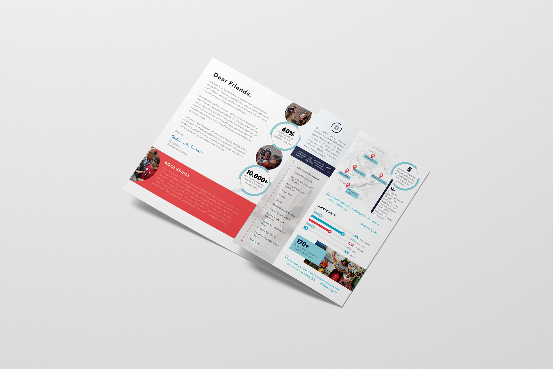
THE PROJECT:
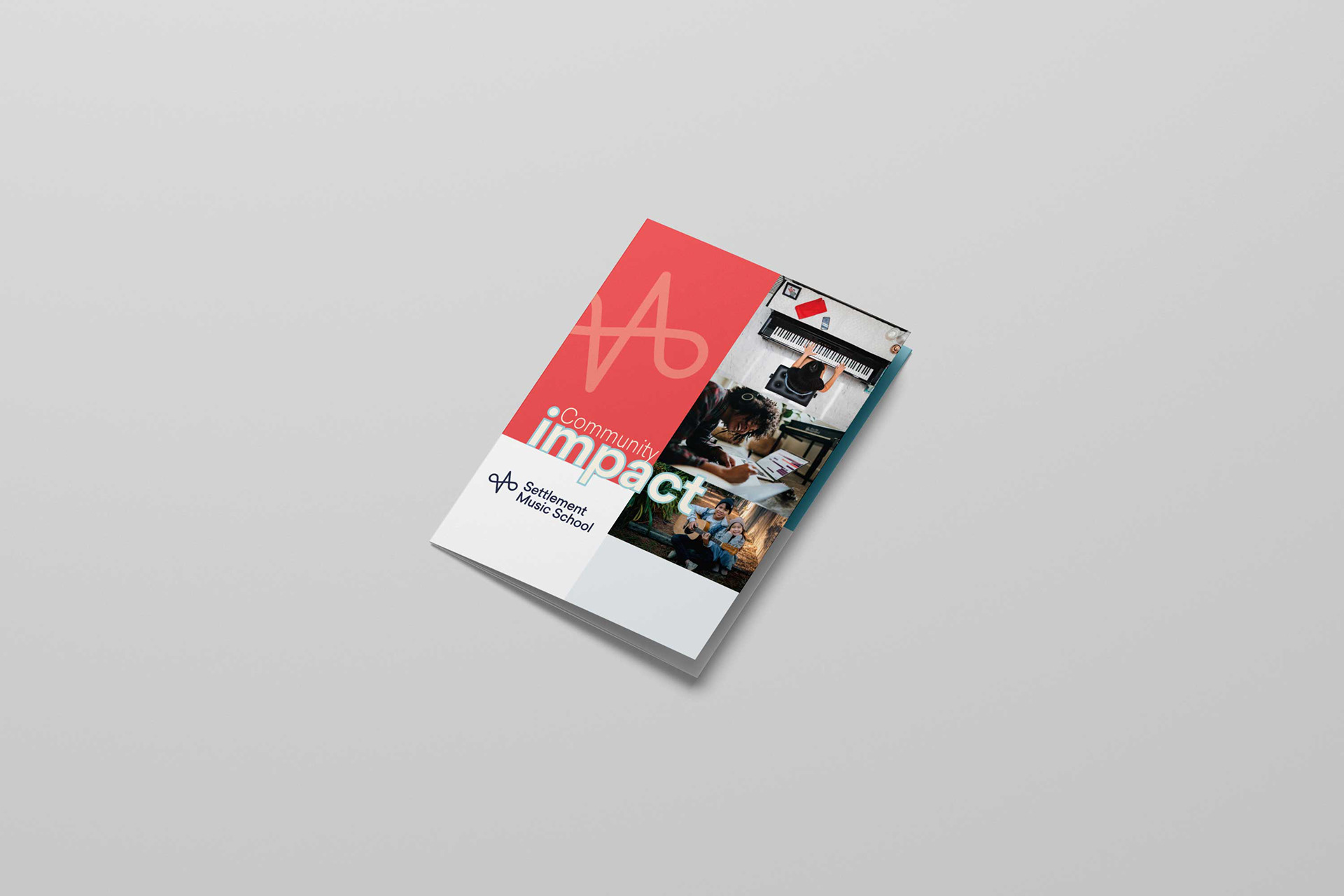
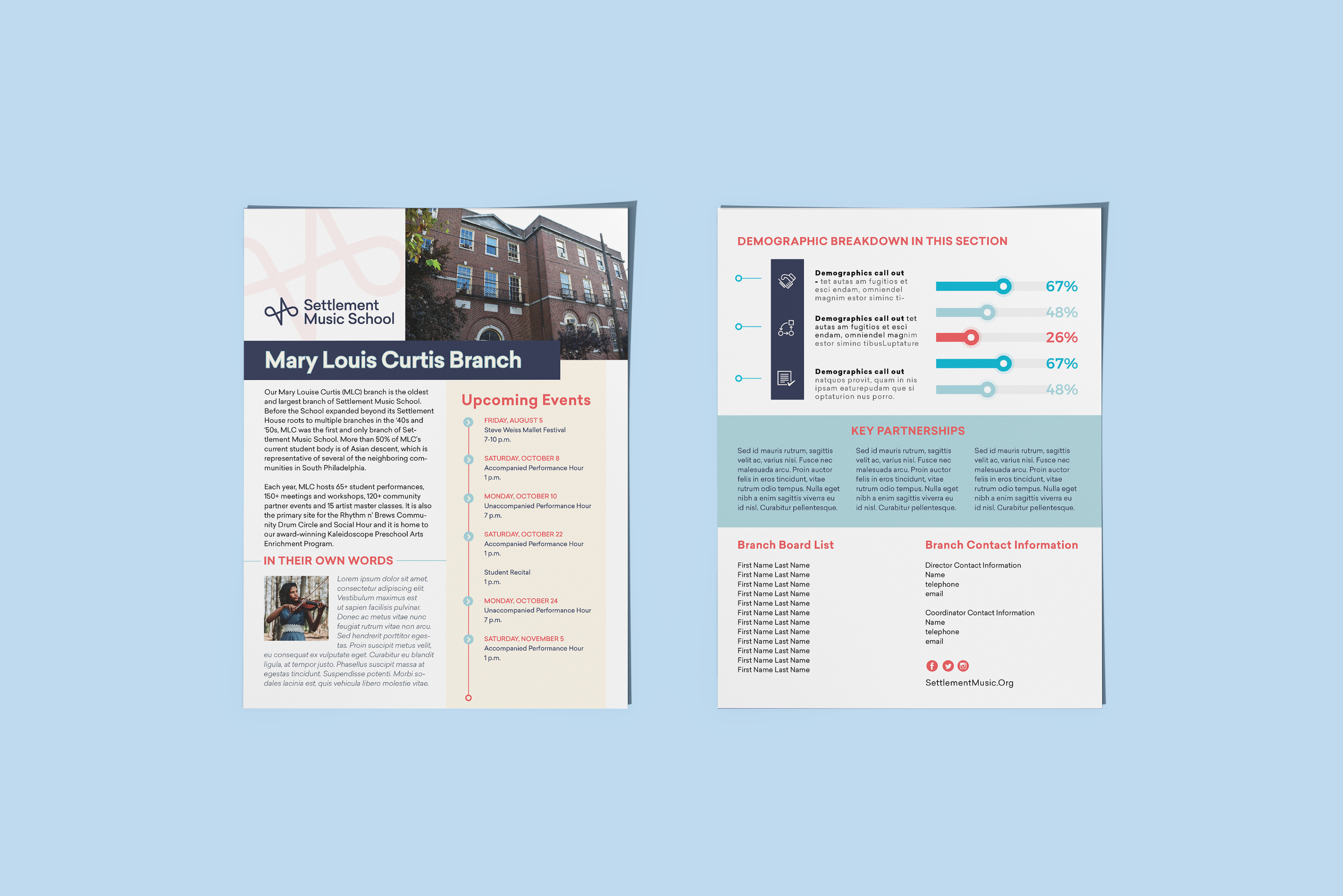
Create a letter sized trifold brochure for Settlement Music School to use in their fundraising efforts, to recruit potential Board members, and for the community to learn about the organization. Part of the project was also a two-page flyer template for each branch to use and update.
Role: Designer
THE CHALLENGE:
Settlement Music School recently rebranded, and they were trying to update materials to match their more modern and colorful brand. They were finding it difficult to work within the new color pallet without veering into the childish. They wanted a modern look, but also didn't want to stray too far away from their more traditional aesthetic. It took time and communication to find the right balance between the two.
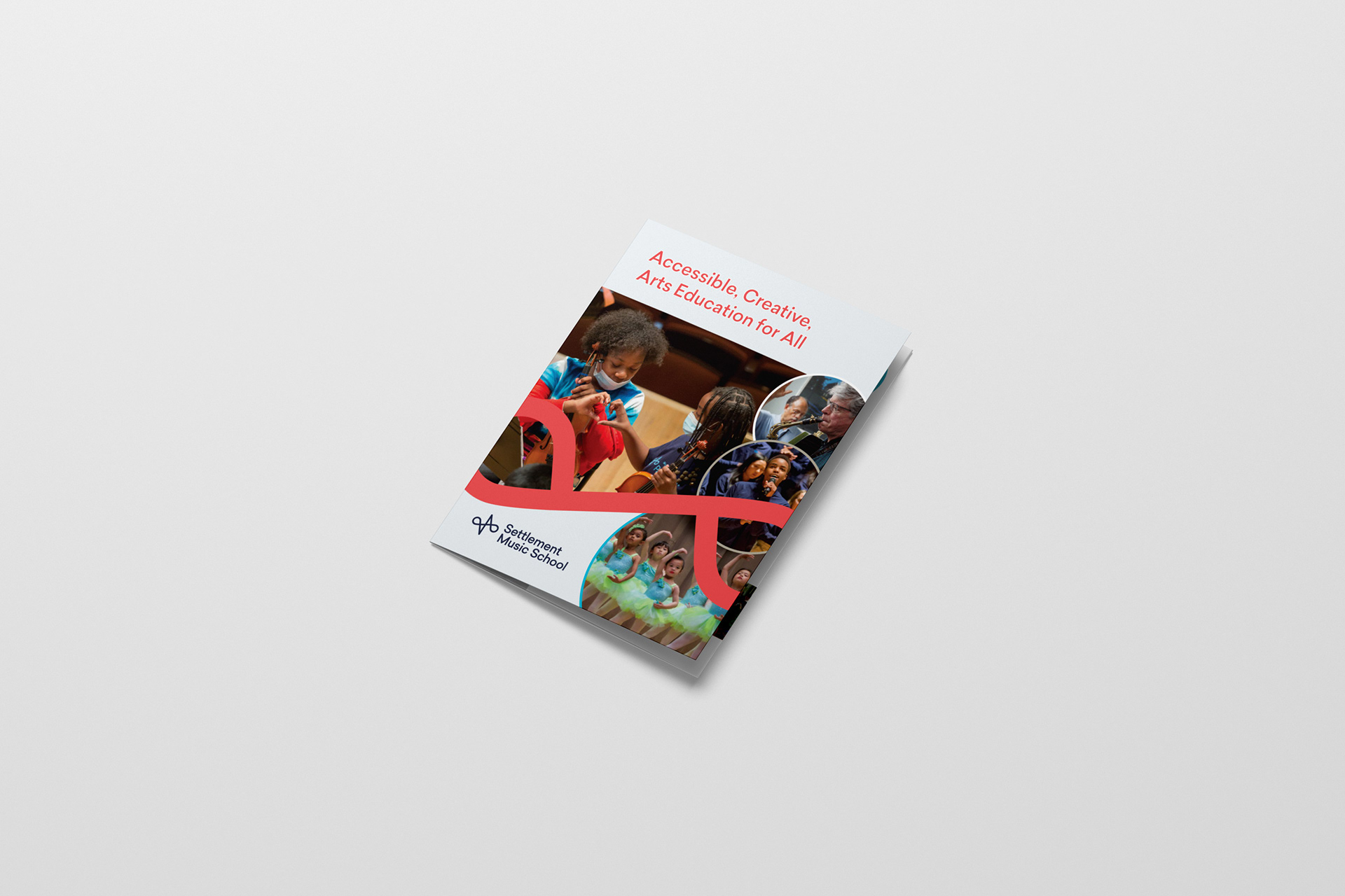
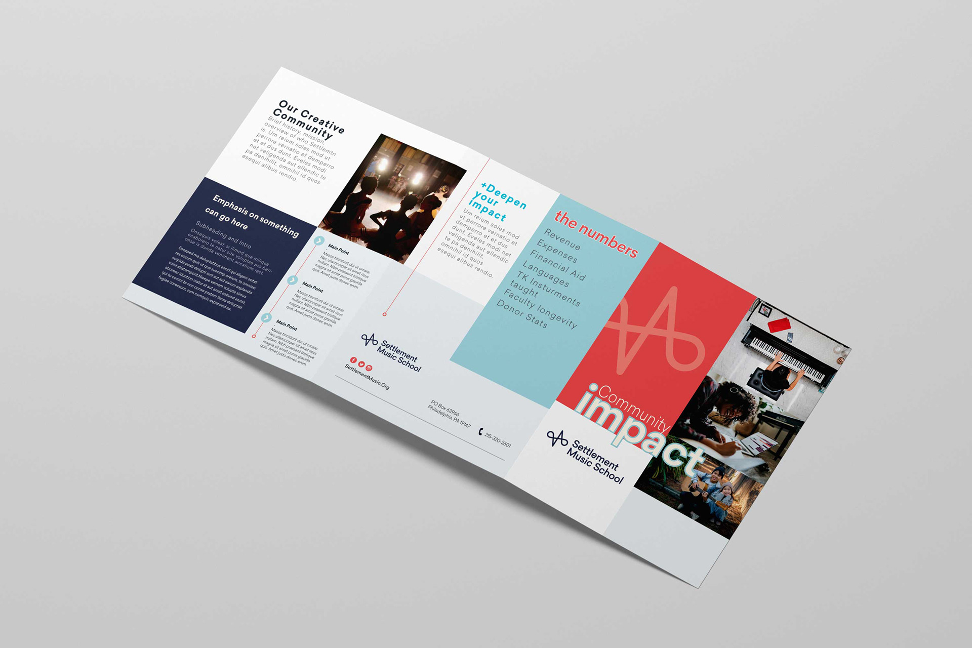
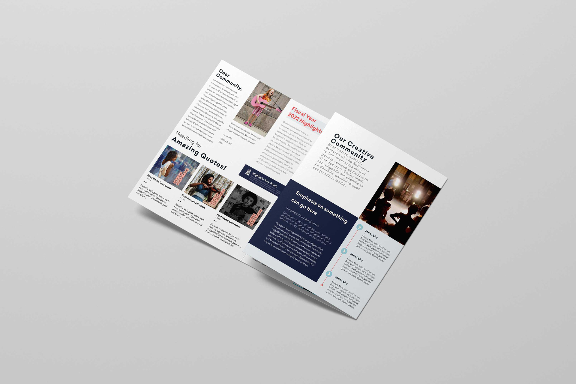
Below you can see the initial concept mock-ups for the brochure. Overall the initial concept was too blocky and too different from the flow of their previous publications. They liked the colors and the brightness, but also found there to be too much white space - especially in light of the text they wanted included.
Concepts:
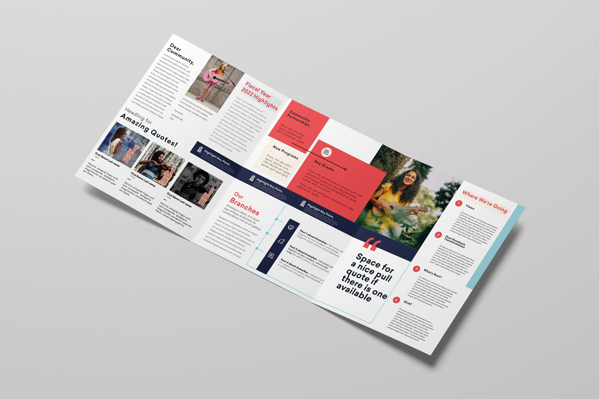
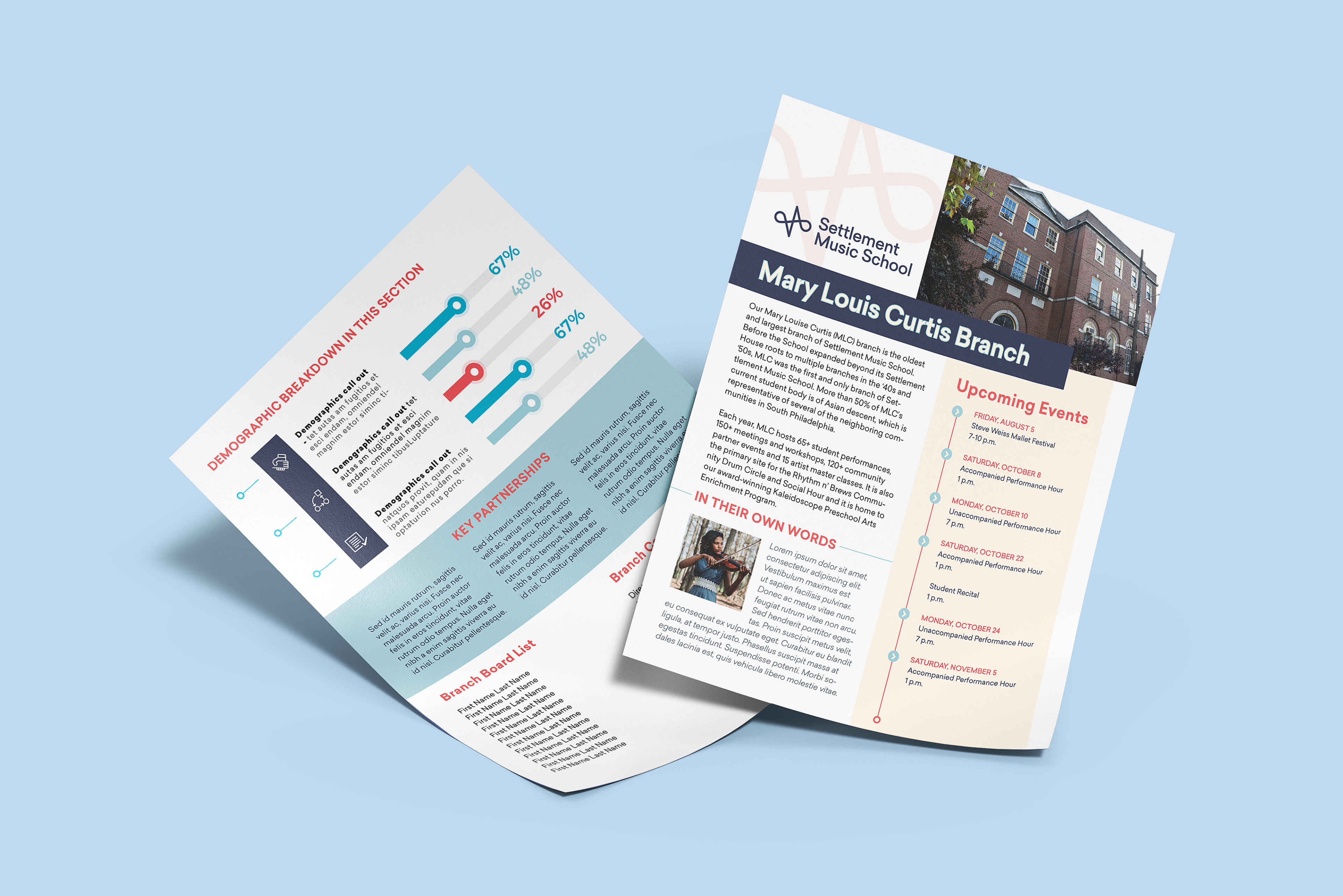
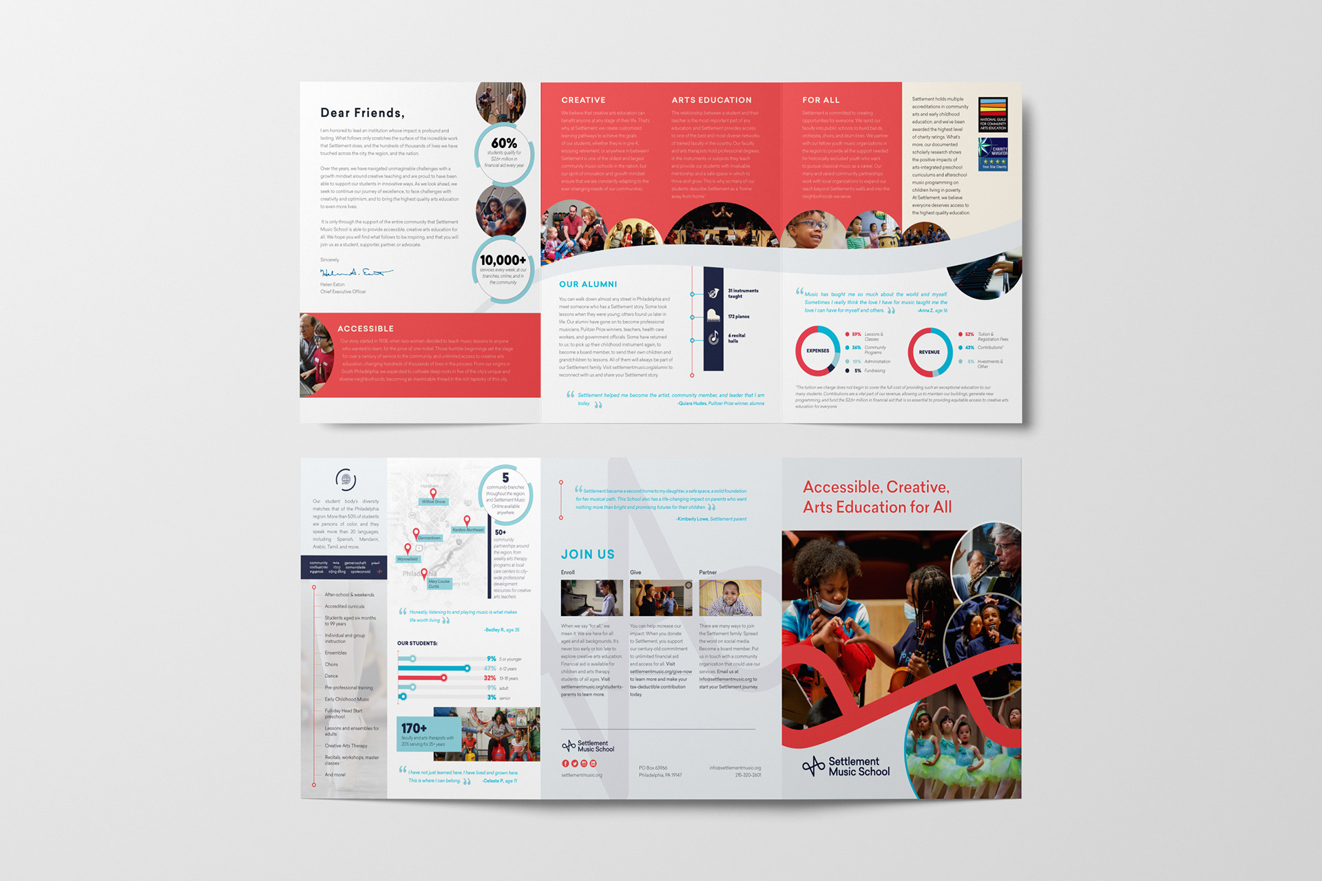
Final Design:
The final product ended up being a combination of bright colors with traditional elements such as more organic and less "blocky" swoops and circles, emphasized throughout with their new brand mark.
REFLECTION:
This project was a lesson in finding a balance between old and new. Sometimes organizations want to take their design in a new direction, and sometimes they are a little more cautious about how they roll out new materials. I learned to ask more questions during the project in-take process to see if I can help the clients clarify their vision, wants and needs before starting on concept designs. But I also learned that often clients need a starting point to react to, and I need to take that into account in future planning and budgeting for each project.

Thank you for your message. I'll be back with you shortly. -Andrea, Miller Tan Creative