THE PROJECT:
To build a brand identify for a new wellness-based boutique physical therapy practice that reflects an open, respectful, motivational business that is rooted in a mix of approaches for healing.
THE PROCESS:
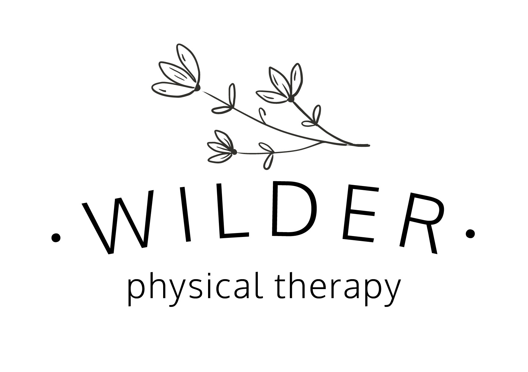
This was a highly collaborative project where I worked directly with the business owner. She was clear on the direction she wants her business to grow, but open to imagery, colors, and fonts. The initial round of concepts included four different concepts and then feedback was compiled before moving onto edits, revisions, and more concepting.
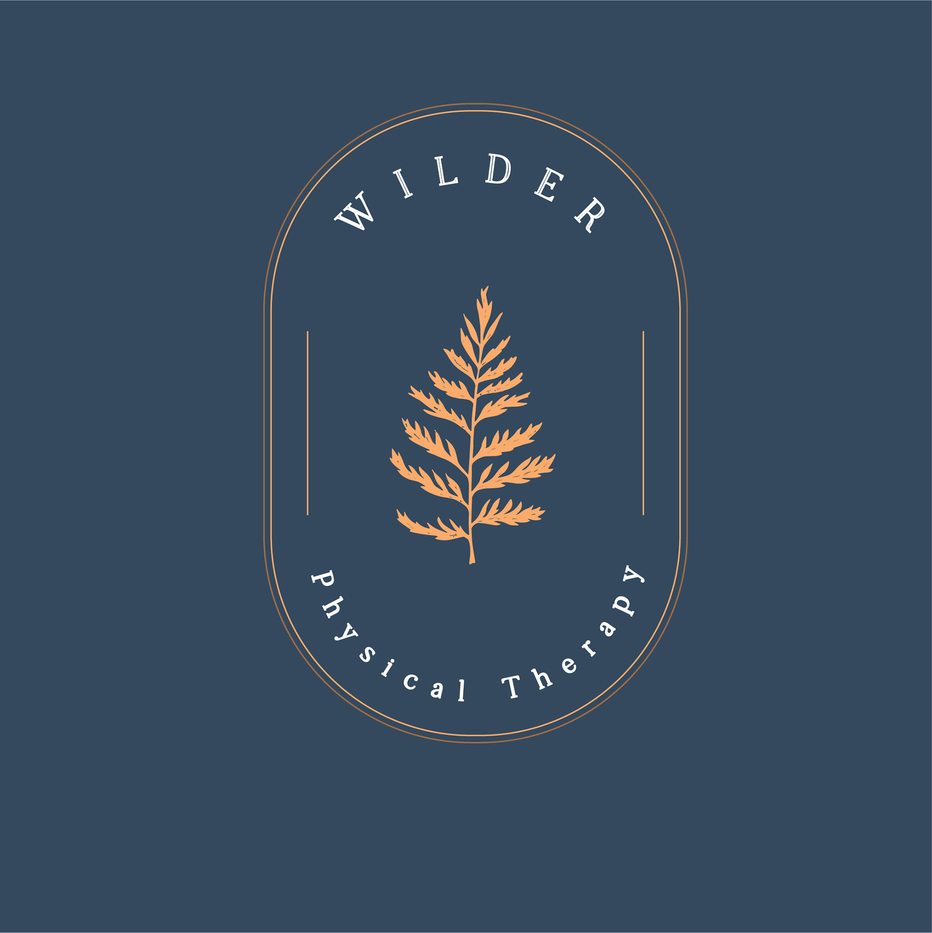
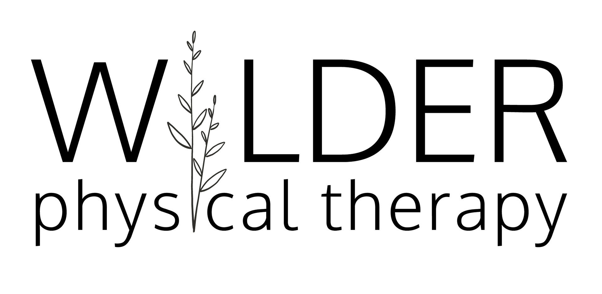
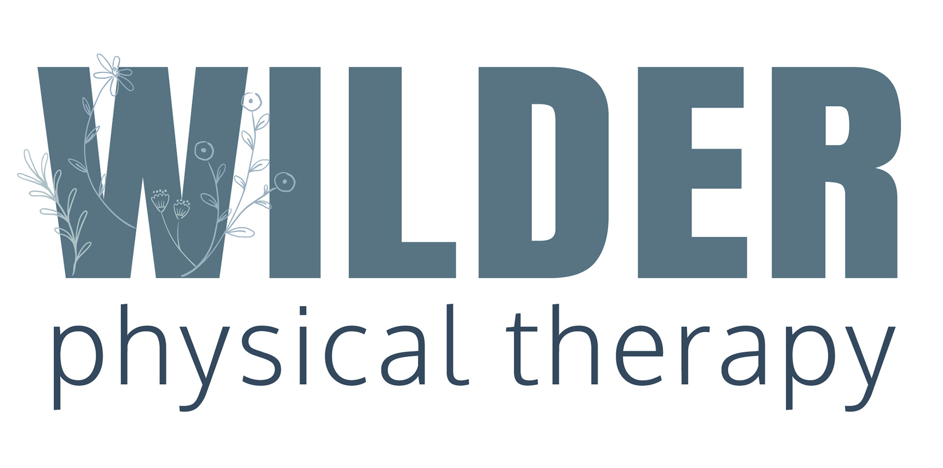
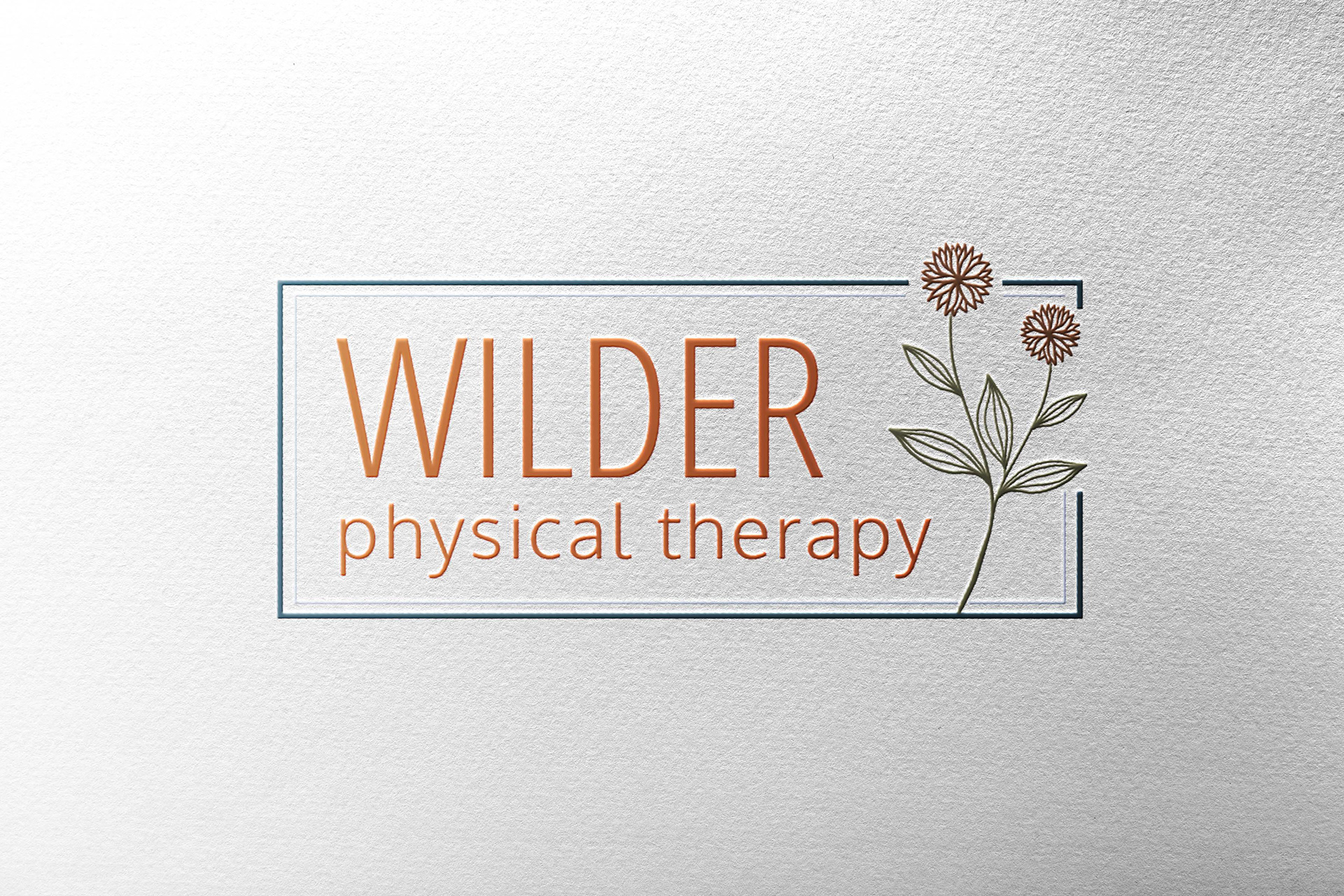
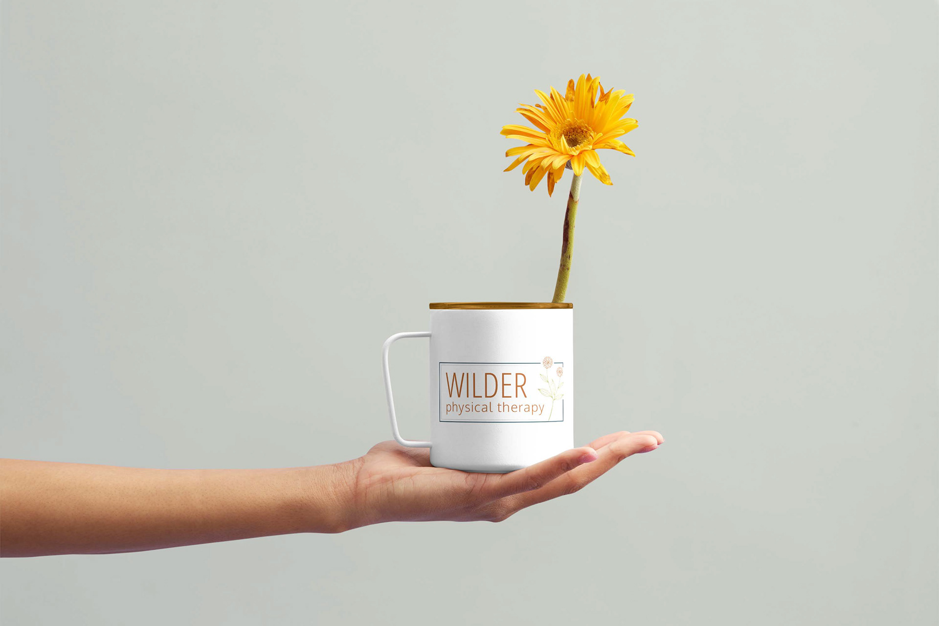
Based on feedback and collaboration the final logo grew out of the initial concepts. We narrowed down what was important (a flower since the business "Wilder" is an outgrowth of wildflowers growing in a field. Wild flowers are perfect in their imperfection and that is the mindset of this physical therapy practice.
REFLECTION:
This project was interesting because I wasn't constrained by a corporate style guide. I was more free with the use of fonts, colors, and styles. This was a highly collaborative project, which I enjoyed. There were several rounds of revisions and variations of the logo until we landed on the final version. Sometimes it can be frustrating to have multi go-rounds, but I think it made a stronger finished product, a stronger relationship, and helped grow my skills - especially in the presentation of concepts (talking them over instead of sending them via email is key!).
Wilder Physical Therapy is a brand new business and I enjoyed working with a new business owner to get an idea out of her head and come to life.

Thank you for your message. I'll be in touch with you shortly. -Andrea, Miller Tan Creative